

In Desktop and End User Support Automation journey deploying Self Service for Users is first step. It will not succeed until you analyse the data this program is generating and make informed changes for better results.
In this post you will learn how use analytics data. Data is collected when end user uses the portal or solution.
Admin portal –
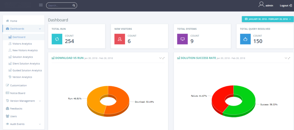
How is this portal organised –
Admins can perform 2 kind of tasks in this portal –
- Customize user self support portal. For example – add a new solution, add a pdf card, link or add a new notice
- See detailed usage data for self support portal
In this post we will discuss only the portion where admins can see detailed usage data.
The left area – shows all the options. All the analytics data is shown inside Dashboard item.
The top area – always shows the consolidated view (from the day it is live till now)
The date selector – Allows you to select date range. The bottom section date is shown based on selected date. The top area does not change based on date selection
The bottom area – Shows the data related to selected date range
What usage data are available –
Dashboard – It shows consolidated usage data using charts. You can see data like how many time solutions has been run, what is the success rate, how many unique systems are using this, what channel is being used most, are they making full use of self support portal, what is top category driver etc.
Visitor Analytics – For selected date range it shows number of Self Support visitors for each day and the pages they are visiting.
New Visitor Analytics – For selected date range it shows number of new visitors and their names. Any one coming for self support portal for first time is a “new visitor”. This section can help you to assess the effectiveness of your adoption program. You will see a spike when company wide mailer is sent to all employees.
Solution Analytics – Shows stack For selected date range shows number of downloads, runs, success, failure cases. It also shows summary of mentioned data for each solution. This data gives you a feel of what is being used more in your environment. And also what is not being used so probably time to phase out those solutions.
Silent Solution Analytics – This section gives you tabular view containing a row for each use of silent solution. It shows data like user name, host name, whether there was any failure during code execution, detailed failure/success message, Time spent in resolution, time stamp and channel through it was accessed. Our solutions can exist in multiple format like offline desktop application, online portal, or invoked through chat bot.
Guided solution Analytics – This section shows data for guided solution usage. Guided solution differ from silent ones as they guide user step by step to resolve a issue. User intervention is needed. In this case we also store last step done by user , feedback given by users (yes/no and feedback) and time taken for resolution.
Version Analytics – While solutions hosted on online Self Service Portal is always updated the desktop app needs to be installed on all machines. Typically it is through a push mechanism using tools like SCCM or Big Fix. Once our app is on machines it auto updates but there are chances that it might fail in cases like connectivity is not there. To make sure that user is using latest version we store version details. This data is useful when a user reports issue with tool, Agent can go and check version to verify if he is using latest.
You can explore the sections in detail.
Below are some of the frequently asked questions –
How do I know which channel is getting used most?
In Dashboard you can see a pie chart with title “Source wise run”. It shown you breakup of channels like offline, online and chat. This can be correlated with “Silent Solution Analytics” and “Guided Solution Analytics” tables where source/channel data is in one of the columns.